
Tokyo Metro
Transforming the image of Tokyo’s main transportation network.
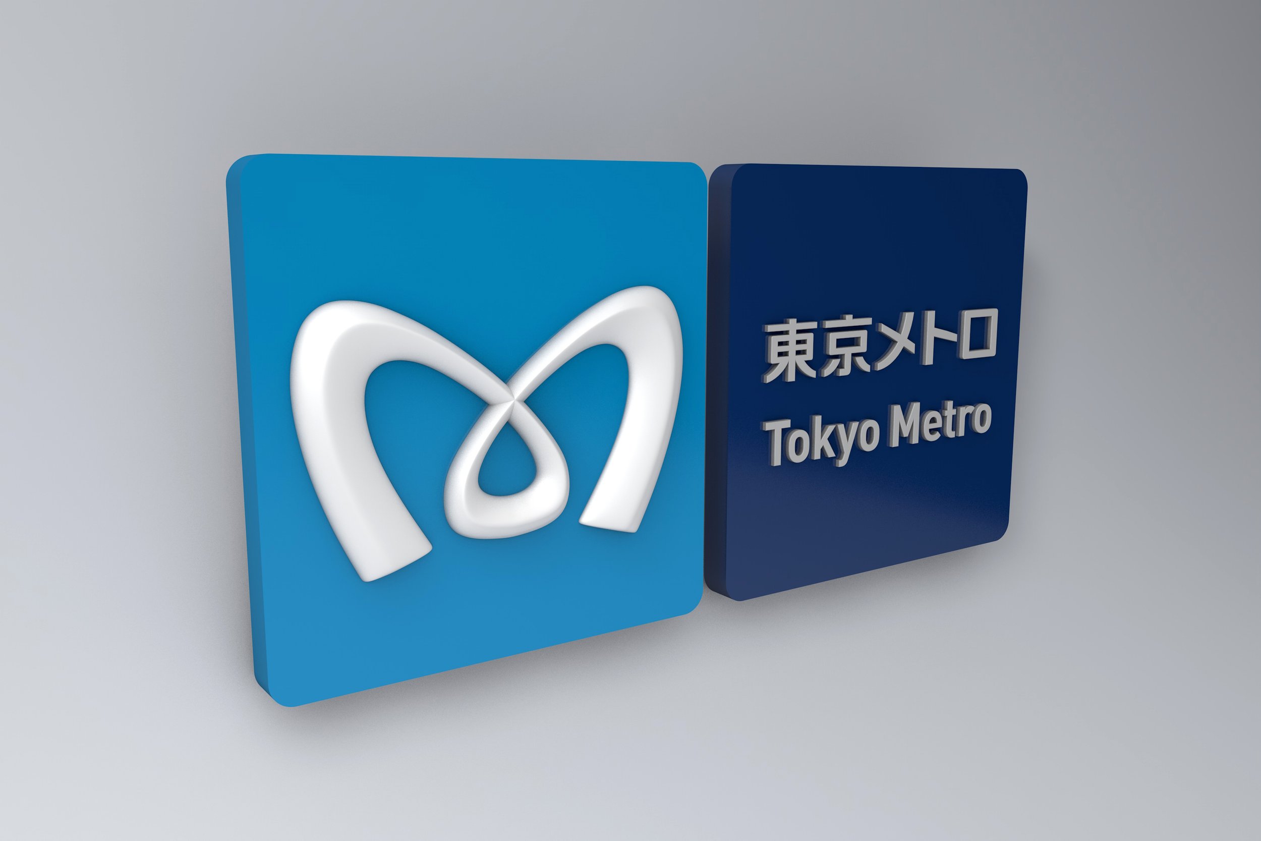
Teito Rapid Transit Authority is one of Tokyo’s two main metro operators, covering three quarters of Tokyo’s underground network. Its ambition was to make Tokyo Metro simple, optimistic and customer-friendly, and in doing so, prepare for future privatisation of Tokyo’s underground network. This required radical change.


Pulse at the heart of the city.
The idea was to represent the pulse and heart of the city as well as to convey a sense of motion and efficiency. The new Tokyo Metro brand feels bright, efficient and uplifting. Bold, rounded and kinetic, the design was developed to appeal to its Japanese audience. The logo has been described many times as a ‘Japanese design classic’.

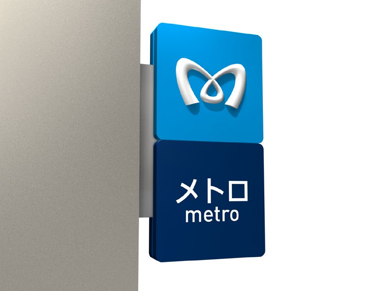
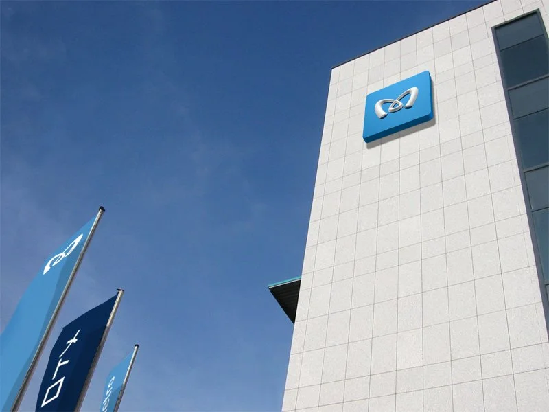
Visual Identity | Signage | Way-finding